

Parameters
Returns
An object containing astartPurchase function and a destroy method to control the purchase widget programmatically. Type of the response is CreatePurchaseResult.
Example
UI Configuration
TheuiConfig parameter allows you to customize the visual appearance of the purchase widget by overriding the default color scheme.
Color Priority System
The purchase widget determines which colors to use based on a priority system:- Highest Priority:
uiConfigpassed directly tocreatePurchase() - Medium Priority: Experience configuration colors (if the offering is associated with an experience)
- Lowest Priority: Default Supertab colors (
#fffffffor text,#000000for background)
Example with Custom Colors
How Colors Affect the Widget
colors.text controls:
- Button text (e.g., “Continue” button label)
- Text color contrast on colored backgrounds
- Any text overlaid on colored elements
colors.background controls:
- Primary action button background (e.g., “Continue” button)
- Progress indicator ring (Omega ring showing Tab balance)
- Visual accents and highlights throughout the widget
Visual Examples
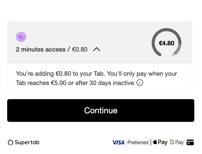
Default widget appearance without custom uiConfig
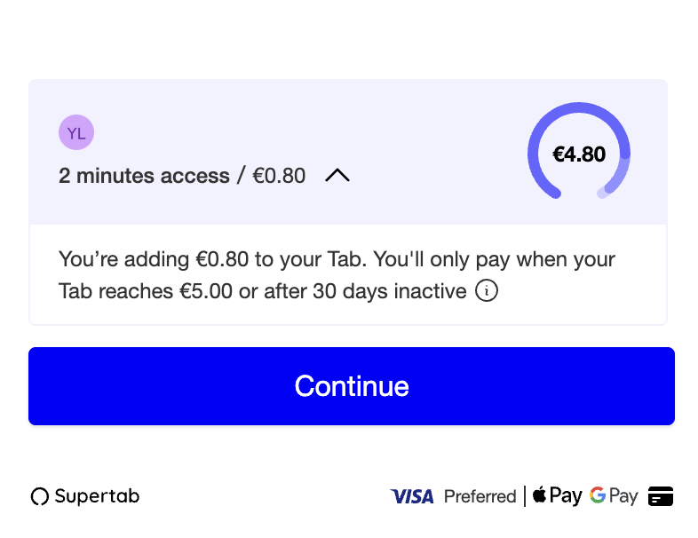
Widget with custom colors: white text (#FFFFFF) and blue background (#0000FF)
The
uiConfig always takes precedence over experience configuration colors.
This ensures you have full control over the widget appearance when needed.Types
PurchaseStateSummary
PurchaseStateSummary type definition
CreatePurchaseResult
CreatePurchaseResult type definition
CreatePurchaseUiConfig
CreatePurchaseUiConfig type definition